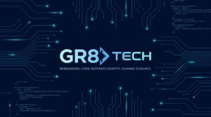
GR8 Tech, the B2B iGaming technology provider, has rolled out a comprehensive brand overhaul that draws its visual language directly from software development culture. The redesign goes well beyond a refreshed logo or colour palette. It introduces a modular, motion-first identity system that borrows from coding syntax, scalable design frameworks, and the aesthetic conventions of modern digital product companies. In doing so, the company is making a deliberate statement: it wants to be perceived as a technology firm first and an iGaming supplier second.
What the Rebrand Signals for GR8 Tech’s Market Position
Brand identity shifts in B2B technology rarely happen in isolation. They tend to follow (or anticipate) strategic pivots, new market entries, or a fundamental rethinking of how a company wants to be understood by its buyers. GR8 Tech’s move fits that pattern, and the details matter for anyone tracking competitive positioning in the iGaming supply chain.
- Tech-sector alignment over iGaming convention: By adopting a coding-inspired visual system, GR8 Tech is distancing itself from the flashy, entertainment-heavy branding that dominates most iGaming suppliers. The intent is to attract enterprise-grade buyers who evaluate vendors on technical credibility.
- Scalability built into the design itself: A modular identity system suggests the company is preparing for rapid expansion across products, markets, or both. Modular branding scales without fragmenting.
- The motion-first approach signals investment in digital-native touchpoints, from product interfaces to trade show presentations, where static assets increasingly fall flat.
- Competitive differentiation through perception: In a crowded supplier landscape, the rebrand positions GR8 Tech closer to companies like Stripe or Twilio in feel, arguably a shrewd move when courting operators who think in terms of platform architecture rather than casino aesthetics.
A Visual Language That Speaks in Code
The most distinctive element of the new identity is its explicit debt to programming culture. Syntax-like structures, bracket motifs, and typographic choices that echo terminal interfaces all feature prominently. This is not decorative. It functions as a trust signal aimed at CTOs and technical decision-makers who are, increasingly, the real gatekeepers in B2B procurement.
And while the iGaming industry has seen plenty of rebrands in recent years, few have committed this fully to stripping away entertainment-sector ornamentation. The result: a brand system that looks more at home on a developer documentation site than a casino floor. Whether that resonates with every segment of GR8 Tech’s audience remains an open question.
Still, the logic is sound. GR8 Tech’s platform-driven approach to iGaming infrastructure has always leaned toward the engineering side. The visual identity now matches the product philosophy.
Why iGaming Suppliers Are Rethinking Brand Architecture
GR8 Tech is not operating in a vacuum. The broader iGaming supply market has been undergoing a quiet but significant shift in how companies present themselves. As regulatory frameworks tighten across Europe, Latin America, and parts of Asia, operators are placing greater emphasis on vendor reliability, compliance infrastructure, and technical sophistication. The old playbook of bold colours and high-energy imagery is losing ground to cleaner, more corporate presentations.
This trend mirrors what happened in fintech roughly five years ago. Payment processors and banking-as-a-service providers moved away from consumer-facing aesthetics and toward enterprise credibility markers. The companies that made that transition early (not all of them did) captured disproportionate mindshare among institutional buyers.
How Brand Perception Shapes Procurement Decisions
There is a well-documented link between perceived brand sophistication and willingness to engage in high-value B2B contracts. Research in neuro-linguistic programming and cognitive framing suggests that visual identity systems function as anchoring mechanisms during early-stage vendor evaluation. When a buyer encounters a brand that mirrors the aesthetic norms of their own industry (in this case, technology rather than gambling), they unconsciously assign higher competence ratings before any product demonstration occurs.
This anchoring effect is particularly potent in markets where buyers are evaluating multiple vendors with similar feature sets. The brand that feels most technically credible often gets the first meeting. GR8 Tech’s redesign appears calibrated to exploit exactly this dynamic. By encoding technical authority into every visual touchpoint, the company is attempting to shift the frame of evaluation before the conversation even begins.
Modular design principles reinforce this further. When a brand system is visibly structured, with clear hierarchies, consistent spacing, and repeatable components, it communicates organisational discipline. Buyers read these signals, often without realising it. The implication is that a company capable of building a coherent, scalable identity system is equally capable of building coherent, scalable software. That inference is not always correct, but it is remarkably persistent in B2B decision-making.
Motion-first design adds another layer. Dynamic visual elements trigger greater cognitive engagement than static ones, a principle rooted in attentional bias research. In practical terms, this means GR8 Tech’s brand assets are more likely to hold attention during digital interactions, from website visits to pitch decks, giving the company marginally more time to communicate its value proposition.
What Comes After the Rebrand
A new identity system is only as effective as its deployment. The real test for GR8 Tech will be whether the rebrand translates into measurable shifts in pipeline quality, deal velocity, or market perception over the next 12 to 18 months. Brand refreshes that stay confined to marketing departments tend to fade quickly. Those that permeate product UX, sales collateral, and partner communications tend to compound.
| Element | Traditional iGaming Branding | GR8 Tech’s New Approach |
|---|---|---|
| Visual language | Entertainment-driven, high-saturation | Code-inspired, modular, minimal |
| Target perception | Gaming and leisure | Enterprise technology |
| Design scalability | Often campaign-specific | System-level, built for reuse across products and markets |
| Motion design | Decorative or absent | Core to the identity framework, not an afterthought |
Whether competitors follow suit will depend on how the market responds. But GR8 Tech has, at minimum, forced a conversation about what a modern iGaming technology brand should look and feel like.
Frequently Asked Questions
What prompted GR8 Tech to rebrand?
The company sought to align its external identity with its positioning as a technology-first iGaming infrastructure provider, moving away from traditional gaming-sector aesthetics toward a system rooted in software development culture and modular design.
Is this purely a visual change?
No. The rebrand introduces a full identity system, including motion design principles, scalable component structures, and a coding-inspired visual language intended to permeate product interfaces and commercial materials alike. It reflects a strategic repositioning, not just a design refresh.
How does this compare to rebrands by other iGaming suppliers?
Most supplier rebrands in the sector retain entertainment-oriented visual cues. GR8 Tech’s approach is notably more austere and technically coded, placing it closer to enterprise SaaS branding conventions than to anything typically seen in iGaming.